Showing posts with label Construction. Show all posts
Showing posts with label Construction. Show all posts
Friday, 5 April 2019
Tuesday, 12 March 2019
Monday, 11 March 2019
Wednesday, 27 February 2019
evaluation of radio 1 presentation
What was the task you were assigned?
- We was assigned to create a short 3 minute voice clip by recording an audition tape of a new radio 1 Breakfast Show program. We needed to consider timings, chats, famous people interviews, music, jingles and all of the radio 1 standards and remits as well as the 30 second news and weather. We also needed to think about the fun games and the daily quizzes, prizes and include new British music.
Who was in your group and what was everyone's role in the task?
- My group included Louie and George.
- Together we created the script and then Louie and I recorded our voices and then Louie also edited the videos, by applying the jingles, edits, music and timings.
- Together we created the script and then Louie and I recorded our voices and then Louie also edited the videos, by applying the jingles, edits, music and timings.
What fresh ideas did you bring to the program?
- we included a new quiz: 'finish off the lyric', with a huge give away prize (a chance to jet off to Orlando with three other special guests)
- we included upbeat music in the background
- upbeat presenters
- chatty dialogue
- we included a new quiz: 'finish off the lyric', with a huge give away prize (a chance to jet off to Orlando with three other special guests)
- we included upbeat music in the background
- upbeat presenters
- chatty dialogue
Who did you interview?
- interviewed John from Great Yarmouth (prize winner)
- interviewed John from Great Yarmouth (prize winner)
What tracks did you choose and why?
- 'that sound' by Sam Fender
- 'Thursday' by Jess Glyne
- both up to date music from 2018, targeting the younger generation. However they are diverse in category; 'Thursday' is a rather 'girly' song, exposing emotions and a rather slow beat, and 'that sound' is stereo typically preferred by boys and is upbeat and overpowering.
Who is your target audience?
- The target audience we were aiming the show at were the younger listeners - ranging from around 15-29. This is because these artists are likely to appeal to them. In contrast to older listeners that would rather listen to more classical and jazz music.
- The target audience we were aiming the show at were the younger listeners - ranging from around 15-29. This is because these artists are likely to appeal to them. In contrast to older listeners that would rather listen to more classical and jazz music.
What do you think you could have improved in terms of content ?
- to possibly include more content in terms of interviews, especially with celebrities, or include some social media content (tweets, quotes, posts).
this would attract a younger audience by involving the social media and would also enable them to interact with the radio presenters and the company as a whole.
This would also link to the expectations of a BBC Radio 1 presentation as Greg James always interacts with the audience by using social media and includes many interviews.
How did you relate to/attract your audience?
- Also, we added a chatty dialogue to entice the younger audience.
- Our prize also would attract a mix audience due to its varied enticement
How does your product fit in with the BBC/PSB remit?
- I believe that our product fitted in with the BBC PSB remit as it entertained the audience with original ideas
- We used a jingle and the intro to BBC Radio 1 so that the listeners know what channel they are listening to and what sort of themes they will be hearing - upbeat, happy, chatty recordings. On the other hand, we had to ensure that the 3 minute recording was guaranteed to educate, inform and entertain the targeted audience. These are all factors that people would recognize the show as when they listened.
- We used a jingle and the intro to BBC Radio 1 so that the listeners know what channel they are listening to and what sort of themes they will be hearing - upbeat, happy, chatty recordings. On the other hand, we had to ensure that the 3 minute recording was guaranteed to educate, inform and entertain the targeted audience. These are all factors that people would recognize the show as when they listened.
What was your initial feedback? What did others say about your production?
We had rather positive feedback:
- very informative
- chatty dialogue
- good editing and music
- included many aspects: weather, news, quiz, music
- clear voices
- social media/ number was clearly addressed
however the only negative aspect was the unenthusiasm within some parts of the dialogue, therefore to improve we would alter to an genetic tone to reflect on the audiences' mood.
To improve?
- In terms of improvement, our group could have involved a celebrity artist or a famous person ringing into the show.
- We could have also used more people within the recording to make it more interesting - for instance, examples of different people listening to the show.
- Change the tone of voice so it sounds more entertaining and easier to listen to.
Friday, 15 February 2019
script for radio 1
Script:
- last 10 seconds of Sam Fender (That sound)
- Sting sound
- Grace: 'that sound' by Sam Fender, a great up and coming artist to watch out for …this year.'
- Radio 1 intro sound.
- Grace (with background music):'I'll quickly send you over to Louis for the latest updates… and whether or not we're gonna get some sun… I'd love to get outside… bring me sunshine…'
- Weather intro sound
- Louis (with background music): 'Thanks Grace… no promises on that sun…
Top stories at the moment… A schoolgirl from London that fled to the Islamic State is trying to return to the UK… as you'd expect, big problems are stirring on what the rules are for her re-gaining British citizenship…
Prince Phillip has said Goodbye once and for all to his lifetime driving license… the Duke was driven to this after the recent collision, loads of people commenting and protesting about the termination of his license…
And just this morning, reports of a car ploughing into pedestrians outside a Primary school in Birmingham… possibly multiple casualties… were not quite sure of the extent right now.. but will update you ASAP…
'The Weather today… miserable… doesn’t look like you're gonna get that sun quite yet Grace… Its gonna be a cold week… however, 13 degrees on Saturday, so we could be seeing a bit of sunshine over the weekend leading into a warmer few days next week…. but today, tomorrow… up until Saturday its gonna be a cold one… some light showers in the South… In the north its gonna be quite windy for the remainder of the week….. So could be a week to stay inside and binge a few series… back to you Grace.'
- Sting sound
- Grace: 'So like I said earlier on, we are doing a HUGE giveaway… taking place for a chance to Jet Off to Orlando with 3 special guests by your side…. of your choice…
All you had to do was Text us on 3 3 3 0 0 saying ORLANDO in capitals and we'll call one of you to ask the winning question… lines close in 20 seconds so if you didn’t enter earlier on, get texting now…….. I'm jealous…… American Sunshine and beaches….. sign me up…..
Get that text in now!... in 3… 2… 1…. lines are now closed guys, The Lines Are Closed….
Lets see who our lucky winner is - We have John in Great Yarmouth on the line…. John, how are you feeling… are you confident ???'
- George: 'Hi Grace, yea this is one of my favourite songs so im feeling super super super super super super super super great about it…'
- Grace: 'Okay, that’s fantastic… lets hear a take on the song'
(song section plays and cuts before last lyric)
'So John, can you tell me what is sung just after the song cuts off?'
(He replies the correct answer)
'(shouting) AYYYY JOHN YOU STAR YOU ANSWERED CORRECTLY YOU HAVE WON YOURSELF AND 3 OTHERS THIS MEGA MEGA HOLIDAY!!' (john cheers) HOW ARE YOU FEELING?'
- George: 'I'm feeling smashing Grace, just smashing'
- Grace: 'awwww, well there you go guys… John from Great Yarmouth is off to Orlando… don’t forget that you have the chance on the first Monday of every month… so keep listening… and scratch up on your songs….
- Sting sound
- Grace: 'next up we have some Jess Glynne for you all….. Thursday…'
- Track starts playing
Friday, 14 December 2018
Daily Mail Mock Up evaluation
What was the task you were assigned?
As a class we were asked to mimic a Daily Mail Front Cover on news that was happening in the world at the moment, for example:
Moreover, the idea was to create a template that was representational to a typical Daily Mail front cover of your choice and we also had to include at least two stories from the examples above.
What did program did you use to complete your task?
The program I used was publisher, as it is relatively simple and is easily adjusted to create a template of a Front Cover.
What tools did you use to create your task?
What were the biggest obstacles to completing your task?
Personally, I believe the biggest obstacle was achieving a similar text to match The Daily Mail title and font. Firstly, I found a slightly similar font that was on the internet that I could adjust and print screen, however after 'fitting' this into publisher, enlarging and cropping, the overall text became blurry. Therefore, I decided to change to Photoshop; this enabled me to adjust the thickness, size and shape of the font without resulting in a fuzzy outline. Additionally, I also struggled with the negative space within the front cover, after several alterations, I managed to achieve a 'packed' perception, like The Daily Mail.
Describe your production and why you chose the various text headings and images?
What was your initial feedback? What did others say about your production?
It took me several attempts to get my cover to appear similar to the original I was copying; there was too much negative space, the image was too stretched, minor spelling mistakes and a fuzzy masthead. Nonetheless, when I had changed the errors, I had feedback of it looking like a Daily Mail Cover, portraying specific aspects that stand out to the viewer and showing a clear representation of a Daily Mail Front Cover.
Identify what went well and with hindsight what would you do differently?
What went well:
What I would do differently:
As a class we were asked to mimic a Daily Mail Front Cover on news that was happening in the world at the moment, for example:
- Child Obesity increasing (energy drinks - high blood pressure, heart disease, cancer.)
- Rumours of Ant Mcpartlin entering the jungle in 'Im A Celebrity Get Me Out Of Here!'
- Salmonella outbreak
- Health Issues increasing
- A case on STD's
- Must include xmas stories/gifts (context)
Moreover, the idea was to create a template that was representational to a typical Daily Mail front cover of your choice and we also had to include at least two stories from the examples above.
What did program did you use to complete your task?
The program I used was publisher, as it is relatively simple and is easily adjusted to create a template of a Front Cover.
What tools did you use to create your task?
- Photoshop (Title, Ant's hat and background)
- Editing
- Cropping
- Removing background
- Researching similar fonts to The Daily Mail's
What were the biggest obstacles to completing your task?
Personally, I believe the biggest obstacle was achieving a similar text to match The Daily Mail title and font. Firstly, I found a slightly similar font that was on the internet that I could adjust and print screen, however after 'fitting' this into publisher, enlarging and cropping, the overall text became blurry. Therefore, I decided to change to Photoshop; this enabled me to adjust the thickness, size and shape of the font without resulting in a fuzzy outline. Additionally, I also struggled with the negative space within the front cover, after several alterations, I managed to achieve a 'packed' perception, like The Daily Mail.
Describe your production and why you chose the various text headings and images?
- I chose the Masthead to be 'Children's Obesity disgraces the nation!' as it portrays ridiculously dramatic expression, similarly to The Daily Mail's over exaggerated stories. Furthermore, this draws the readers in, petrifying all classes, ages and genders.
- I also added a feminist aspect; applying the title 'Sexy jumpers to impress your boss!' displays a ridiculous stereotype of The Daily Mail's connotations of women and their -beautified' interests.
- I wielded a stand alone image of Ant as a 'celebrity story' and included 'Ant is making a return...'. This incises the reader; an unexpected rumour that everyone is going to talk about.
- My subheading also draws attention, due to the dramatic and seriously dangerous consequences that are continuously listed; a shocking reality is portrayed.
What was your initial feedback? What did others say about your production?
It took me several attempts to get my cover to appear similar to the original I was copying; there was too much negative space, the image was too stretched, minor spelling mistakes and a fuzzy masthead. Nonetheless, when I had changed the errors, I had feedback of it looking like a Daily Mail Cover, portraying specific aspects that stand out to the viewer and showing a clear representation of a Daily Mail Front Cover.
Identify what went well and with hindsight what would you do differently?
What went well:
- The Photoshopped image
- The Christmas theme
- The similar font and characteristics
- The representational colours
What I would do differently:
- I would of used photoshop more to alter certain sizes and shapes to minimise the negative space
- Apply a photo to 'sexy xmas jumpers to impress your boss'
Tuesday, 30 October 2018
Sunday, 21 October 2018
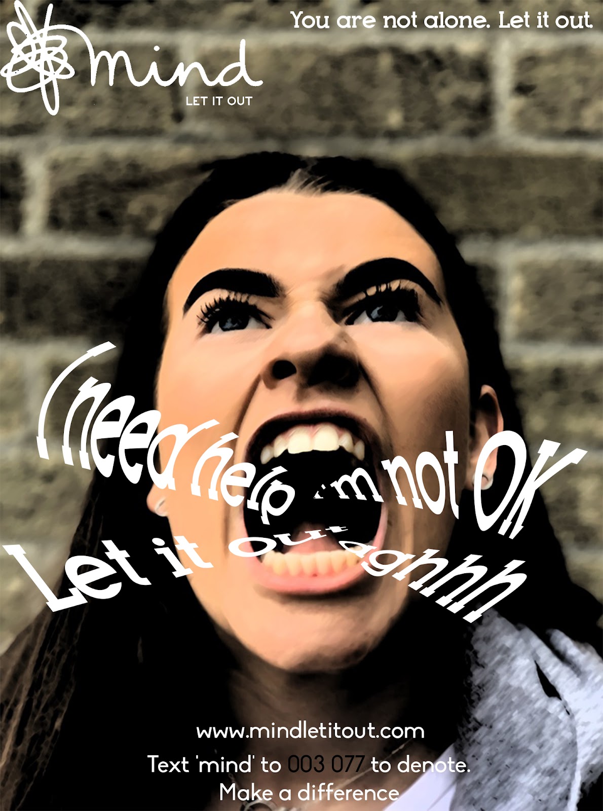
Evaluation on Charity Advert
Evaluation:
What was the task you were given and who was your target audience? As the audience wasn't typical of the product how did you manage to sell it? What was the name of your brand?
My group and I was given a task to construct an advert for a disability charity towards a teenage audience, who struggle with addressing their stress. We decided to focus on the awareness of schizophrenia and display what they see and feel, which allows the viewer to understand the aspects of the disability. At the ending of the advert we applied important facts about schizophrenia, showing how serious this is but also stating the fact that they are not alone and there are people to help, like this Advertising Charity. Additionally, we display our slogan 'address your stress' along side the logo 'Z' (that stands for 'Zoloft', an antidepressant tablet). Subsequently, this further reinforces the help that we would provide and that dressing your stress, allows you to deal with it.
Who did you work with and how did you divide the research, planning, filming and responsibilities?
For this project I worked with Tom Snow, Robert Mckinnon and Sofya Latepova.
For this project I worked with Tom Snow, Robert Mckinnon and Sofya Latepova.
- Tom was the main character, who impersonated an individual who has schizophrenia.
- Rob edited the advert, filmed and produced the plan.
- Sofya completed the analysis; analysing other videos that inspired our advert.
- I also helped with the plan, create ideas and film/act in some parts.
- Our responsibilities were quite fair, however I believe that Rob achieved too much in this project. To change this, me or Sofya could of helped with the editing.
How did you plan your sequence?
We organised a clear and sufficient plan, splitting the sequence in several parts - using a table - highlighting the camera shots, the duration, the process and the special effects. This helped us be organised and prepared as we knew what we was doing step by step. It allowed the group to display our different ideas, to see what worked and what didn't.
What research did you undertake?
As we was advertising a charity, we had to research information about what other charities achieve, which could influence our video. For example, we noticed that most videos included: subtle and sad music, a slogan, facts and a soothing voice over. Furthermore, after deciding to focus on the aspect of schizophrenia, we watched more videos that focused solely on this disability, which helped a lot as this gave us a clear understanding of what we needed to include and involve in our advert.
What was you initial feedback? What did others say about your production? How successful was your sequence?
My group and I was really happy with the final edit, due to the advert clearly showing how people with schitophrenia feel. The jolting shots and transitions, the suspicion of sensory overload, the dense and dark appearance, and lastly the dramatic non diegetic sounds imitates what this disability is. Therefore, I believe this project was very successful. Nonetheless, to improve I - personally - would include a softer appeal, with more meaning, which enables the audience to not only connect with the charity and its purpose but to understand what this certain individual is going through.
We haven't been given initial feedback from others, however we would take negative and positive feedback inconsideration.
We haven't been given initial feedback from others, however we would take negative and positive feedback inconsideration.
What have you learnt from completing this task?
From this task i have learnt the importance of planning, communication, creative input and lastly using our initiative.
- Planning allowed us to be extremely organised and confidently happy with the ending result.
- Communication enabled our group to discuss what we liked and disliked and express our ideas. It also helped us to avoid misunderstandings and complete the project in a quicker and more efficient manner.
- Putting forward our creative ideas was difficult as designing a charity for a disability was something we haven't done before. However, just by designing a name, slogan and logo dramatically helped as a starting point. Additionally, after researching our creative input increased.
- Using our initiative allowed us to improve, prevent issues, and more importantly achieve an organised and well thought out project.
plan for advert (disability charity)
Camera
DI
S- Scenes switch often, however at the beginning, people with mental illnesses are mostly in dark places or in places where it would be easy to suffer from sensory overload, such as the party and on the bus
T- A prominent theme throughout the advert is the struggle to overcome bad situation and the mental illness. Kindness is also a major theme, since people who are allies of those with mental illnesses are portrayed in a very positive light
I- Important icons include the crisp packet and the 'stop button' on the bus since they show that even small, everyday things can cause stress and anxiety in people with a mental disorder
N- The struggles of people with mental disorders and the solutions, which can be offered to help, such as having someone to rely on
C- People with mental disorder, allies of those people and the mass (People on the bus/ at the party)
T- "#We can, we will" is the slogan, which was used, because it is memorable and inclusive, with the repetition of 'we' creating a sense of community and togetherness.
Mise en scene
C- The characters with mental disorders are all wearing dark, dull colours such as black, which often represents mourning and has connotations of depression and sadness. The man at the party has a shirt with the words "believe in yourself" written on it which shows that they too, can have confidence in themselves as long as they have someone else to rely on.
L- All the characters with depression seem to be in places which are not very well lit, such as the woman in bed, the man at the party and the man in the music room. Their faces often have light falling on only half of their face which creates an atmosphere of isolation around them. However by the end, the lighting becomes bright and fully illuminates the people's faces.
A- The actors are of different ethnicity and age to show that people of all types are affected by mental illnesses
M- No make-up used for effect
P- A good example of a prop is the book the musician has, which transforms by the end into something completely different and shows that through a struggle mental disorders can be slowly overcome
S- The scene is set during different times of the day for different people to show that their disorder affects anything and everything they do, during day and night
Sounds
M- At the beginning, the music sounds sad, however by the end it becomes inspirational because of the images that are being shown alongside it
C- No contaparallel
D- Diegetic sounds such as the crisp packet, the button on the bus and women laughing are all used to create an overwhelming atmosphere
O- No sounds Off-Screen
V- Voice-over used to narrate the struggles of people with mental disorders as well as offering a solution to dealing with them
E- Emotive language is used throughout the video to make people sympathise or emphasise with those struggling with a mental disorder
D- No dialogue can be heard throughout the video, and any speech between characters is silent, leaving the audience to rely on the actor's facial expressions to work out what is being said
Editing
S- Each person with a disorder gets somewhat equal screen-time,
T- Most of the transitions, are smooth, until the woman with anxiety suffers from sensory overload and the transitions become fast, showing her discomfort in the situation
O- There is no way to know what order things are done in, however the jumps from night to day would suggest that this is a random order of narrative as we go through different characters and their conditions
P- The pacing is slow at the beginning, however the woman with anxiety on the bus quickens the pacing
S- No special effects used
Camera
DI
S- Set in a typical office environment in the modern day
T- A prominent theme throughout the advert is the struggle of making a decision and normalising speech about the issue of mental illness.
I- Icons include the shoe which shows the incorrect interpretation of people with mental disorders
N- A man questioning whether he should ask a colleague how his day was because he heard he has a mental disorder and the video ridicules that fear, making it seem undeserved and absurd.
C- Person who was off work with a mental health issue, the colleague who was doubting whether he should speak to him, other people at the office (extras)
T- "It's time to talk. It's time to change" is the slogan, which was used, because it is memorable
Mise en scene
C- Both men are wearing formal wear which makes them look similar and shows that it is hard to differentiate between people with mental disorders and those without
L- At the beginning of the advert the lighting is white and harsh, however it is dull, making everyone seem pale and sickly. However, at the end, after everything is resolved, the light becomes brighter.
A- The actors are two men, the main character is portrayed as ridiculous for doubting himself about an insignificant question, his posture is slouched and he looks uncertain
M- No make-up used for effect
P- An important prop is the printer, which is used to show the absurdness of the fear of talking to a person who suffers from a mental illness
S- The artificial lighting in the office makes it impossible to know during which time of the day the scene was shot
Editing
S- The two men get equal screen-time, although the main character gets slightly more time so that the audience can find out what he is thinking
T- The transitions are smooth and fast
O- The shots are in chronological order and real life time would be equal to the video time
P- The pacing is slow throughout the first part, however it quickens after the question is asked, for comedic effect
S- Making the man seem like he exploded in a burst of white powder
Camera
I
S- Set in a living room of a normal family home
T- A prominent theme throughout the advert is the struggle of loneliness
I- No icons
N- A man struggling with a mental disorder (depression), who feels better with his friends and family
C- man with depression, family members
T- Uses statistics to inform and persuade to become an ally
Mise en scene
C- Normal clothes for a home, creating a warm, family atmosphere
L- At the beginning of the advert the lighting comes through the curtain behind the man, which makes only the silhouette visible, making seem isolated. At the end, when the family is having dinner, the room is well lit and everything can be seen clearly
A- The main actor is a young man, who, statistically, is very likely to suffer from depression and other mental disorders
M- No make-up used for effect
P- Important props include curtains, since at the beginning, they dull the light and create the wanted effect of only being able to see the silhouette
S- The scene was shot during the daytime, although at the beginning it is not clera because the light seems unnatural
Editing
S- The man with mental disorder gets as lot of screen time
T- The transitions are smooth and fast
O- The shots are in chronological order and real life time would be equal to the video time
P- The pacing is relatively fast throughout the advert, however at the beginning the end it is quite slow
S- Showing the isolation of the character through special effects
Wednesday, 10 October 2018
Club Advert
My group and I constructed a remake of the 'Club Biscuit' advert as a practise for editing, using diverse camera shots and learning how to use Premier:
Tuesday, 18 September 2018
Subscribe to:
Posts (Atom)
-
https://docs.google.com/document/d/1aJ13cONdae2NH1OQN9MT0NiR1T2IEsxAMt8ozDtBJy0/edit?usp=sharing
-
Tabloid: For example: The Sun, The Daily Mail, Daily Mirror Media Values/language: - Personalisation: stories that includ...
-
How are different social groups represented in the sequence you have analysed? What role does the use of media language, signs and signi...
