Showing posts with label advertising. Show all posts

Wednesday, 29 May 2019

old spice grade b essay

Old Spice has been known for its strange, random advertisements in order to show its products. Within the ad for the Bahamas scent, the ad includes the brand's front man Iasiah Mustafa, an ex NFL American footballer. This has been done as he is a representation of manliness, strength and attractiveness. The brand aims to attract both men and women with women being targeted to buy for their man and men targeted to in order to look like the star. Women are targeted through the man's flirty eye contact giving them a direct mode of address connoting confidence. This would attract women to buy for their men so that they could be like him. Similarly men would want to buy the product as they feel it would make them look like him.

The advertisement has a heavy consistent theme of paradise. The ad shows an exotic tropical beach filled with many people having fun. The idyllic scene would attract customers as they would want to be there and have pleasure in wearing the product. The high key lighting of the image connotes a hot and sunny scene.

This advertisement shows that many adverts rely on attracting their audience by showing them what could happen if they wear the product such as becoming attractive. The advert relies on the ideology of patriarchy in order to draw in women who would stereotypically be attracted to Mustafa as he is a representation of the ideal man.

The advert contains ideas of being fresh and new. For example, within the background of the beach there is a chaotic scene of a nautical ship being sunken. This could signify a reference to their previous unsuccessful branding which targeted older, richer men. By showing the ship sinking, it could connote ideas of getting rid of the old and bringing in the new - the Bahamas scent. This shows how adverts like to draw in audiences by showing that they have the newest brand and have more to offer than other brands.

Old Spice differs from other brands in the fact it uses overt persuasive techniques through the use of humour. Within the tag line, it says a statement followed by 'This fact has not been fact-checked.' This would attract audiences as they aren't presented as serious or openly trying to persuade them but are informal and fun. This is further signified by the absurd use of the image which is random that no other company has been seen to do. This could be to make the audience remember the advertisement, therefore are more likely to buy the brand or this could be part of their USP as their advertisements are different and one of a kind.

grade a essays on music videos and big issue

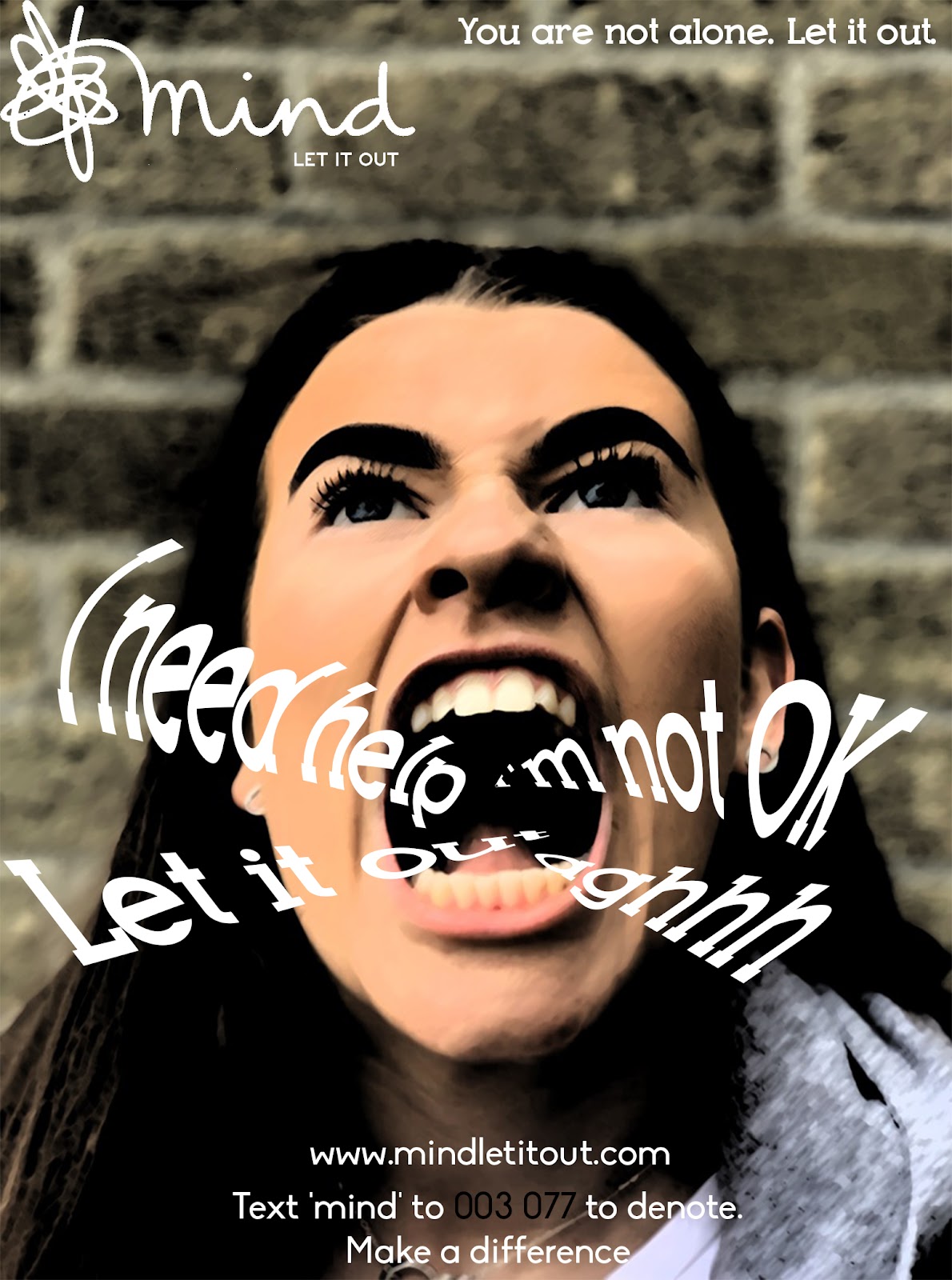
The purpose of music videos is to promote the artist to their audience. The representation of Corrine Bailey Rae (CBR) in her music video Stop Where You Are associates her with the idea of transcending prejudice and inequality. In the video the artist is seen to transcend prejudice. This is achieved by placing the artist in an urban environment encountering young characters who are stereotypically on the edge of society. We see the artist interact with these characters at different points in the video. For example, she goes up to the lonely girl and touches her shoulder as she walks past; she stops the girl gang from fighting by holding up her hands with the lyrics ‘stop where you are’ and she dances with the black youths at the end of the music video. The use of constructing two sides to the characters’ representation, firstly as a threat and then as people with qualities and skills, helps to reinforce that young people are approachable and valuable and that the artist not only believes this but can make the lives of these people better. These representations would appeal to the target audience either through identification with the characters, their age or cultural diversity, or the idea that the artist accepts them all regardless of social stereotyping. The representation of the artist through the production values used in the music video is another way in which the representations of CBR can be seen to appeal to her target audience. Although the video has a social realist, urban theme, the production values are artistic and the way the urban environment, the artist and the characters are represented is stylized. This suggests that the artist is concerned with urban and social commentary but is artistic and stylish regardless. This representation is achieved in a number of ways. The introduction of the artist is very conventional fading her in from a black screen, cutting to her face, her legs and back to her face when singing. The cross cutting of these shots of the artist with the urban location using low angle shots to reinforce the extreme angles of the building with glimpses of the blue sky above creates a meaningful connection between the artist and her environment and suggests that it is one that she, and her target audience, can transcend. The framing of the stairwells and corridors serves to create a sense of entrapment for the characters, especially when contrasted with the placement of the artist with the characters in more open spaces in the choruses and towards the end of the music video. A further way in which the artist is promoted to her target audience is by the use of costume. The red dress is a powerful symbol in the music video. The use of the red provides the only colour in the video and this contrasts vividly against the Exemplar 1 – Level 3 answer, 10 marks 

Examiner commentary This is a comprehensive response which addresses the question set and supports its arguments with a range of references and textual examples from the music video Stop Where You Are. There is demonstration of knowledge and understanding of representations and how this is constructed in the text with comprehensive, detailed and accurate knowledge and understanding of music video conventions and its form as a promotional tool. The response is a clear and balanced explanation of how representations are chosen to promote the artist with reference to how the technical aspects of the video are used in composition of star image. desaturated colour palette. This simple use of costume helps to construct the artist as feminine and unthreatening but also as powerful to her target audience and further enhances her appeal as she stands out against the everyday. To conclude, representations in music videos are chosen by producers to promote the artist to their audience. This is apparent in a number of ways in CBR’s music video which construct an image of the artist as powerful, open minded and as a musician with important social values and messages that will appeal to her audience.

BIG ISSUE question (Abba cover) 13/15

Analyse why The Big Issue magazine has used an intertextual approach to the referendum on its front cover. In your answer you must:
 • Analyse the use of intertextuality to create meaning in the source
 • Make judgements and reach a conclusion about the advantages of this use of intertextuality to The Big Issue magazine.  

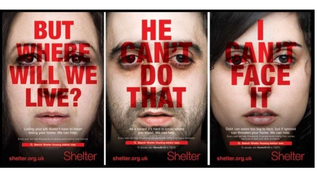
The Big Issue magazine prides itself as niche and providing a critical view that is outside mainstream journalism. Intertextuality refers to the process of creating references to any kind of media text through another text. The intertextual reference to 70s pop band Abba and their song Winner Takes It All to represent the referendum is to reflect the status and identity of the magazine, to appeal to the target audience and to give additional meaning to the referendum vote. One reason why The Big Issue magazine has used an intertextual approach could be to identify the magazine as niche and outside mainstream reporting. The use of the intertextual reference to Abba presents The Big Issue as a magazine that looks at events critically and would likely contrast with reports on the referendum found in newspapers or more mainstream magazines. This approach to reporting the referendum highlights that The Big Issue can be relied on to offer fresh perspectives on current affairs. The representation of the politicians as pop musicians also helps to position the magazine as informal and witty. The use of intertextuality through inclusion of the song’s lyrics is a further way in which the magazine has adopted a witty approach to the event. The lyrics have been adapted to reinforce the viewpoint each politician on the referendum. This shows that the magazine is confident that the lyrics have cultural significance and are well known by its readers. They are also assuming their target audience will have a good grasp of current affairs and will appreciate the personalised link between lyrics and politician. An intertextual approach through the use of text is further achieved with the issue’s headline: Winner Takes It All. This is used to develop the Abba reference and the band’s song but, in terms of the political context, it is also highlighting that the result of the referendum will only have one outcome and it will be significant for whichever side wins the vote. By using the intertextual approach with Abba in this way, The Big Issue has cleverly managed to satirize the event and the politicians involved, yet remain impartial politically. This helps the magazine to take a more neutral position on the referendum and offers balance for their target audience. This is important because, as a charity, The Big Issue wouldn’t want to alienate readers for fear of disadvantaging the street vendors who sell the magazine. From this front cover, it is evident that the intertextual approach helps to identify The Big Issue as a provocative magazine that provides independent journalism and in doing so, is able to challenge people’s perceptions. A further reason why intertextuality has been used by The Big Issue magazine is to address and appeal to their target audience. The magazine’s audience is 72% ABC1 and 43% AB. This indicates their target audience are likely to be educated professionals and a sophisticated audience who will understand the intertextual reference to Abba, the personalisation of the lyrics and the satire they offer of the issues about the referendum. Through using this intertextual approach, the magazine addresses an aware audience and the references to Abba indicate the audience will enjoy recognising cultural references and satirical representations of current affairs and international politics. A final reason why The Big Issue may have used an intertextual approach on their front cover is to represent the referendum from a particular point of view and in an engaging way. In order to represent their story about the referendum vote, the magazine has placed the heads of the four politicians onto the bodies of Abba’s band members. The use of this intertextual reference, and the construction of the politicians as band members is very humorous. The heads of the politicians, the facial expressions they are making and their body language, through the performance of the original members, fit but look odd. The oversized heads on smaller bodies make the politicians look like puppets and foolish, indicating that the magazine doesn’t hold them in very high regard. It could also suggest that through using the intertextual reference to Abba, by presenting the politicians as a pop group performing on stage, it works as a metaphor to highlight the performance of the politicians courting popularity for their views on Leave or Remain. Through using this intertextual reference, The Big Issue is continuing the history of satirical cartoons that combine political images with popular culture which helps us to see the referendum in a new way, and leads us to question the motives of the politicians involved. Therefore, there are a number of reasons why The Big Issue magazine has used an intertextual approach to the referendum on its front cover. The identity of the magazine as intelligent, witty and both politically and culturally relevant is expressed through this approach and helps the magazine appeal to its educated and intelligent audience, whilst taking a satirical approach to the politicians involved in the referendum.

Wednesday, 3 April 2019

charity essay


Analyse how social and cultural contexts can influence advertising

In your answer you must refer to:
- Analyse how social and cultural contexts influence advertising
- Make judgement and reach a conclusion on why they advertise in this way
Image result for shelter print advert


Shelter was founded in 1966, London and use hard hitting campaigns, such as this one, which launched in 2011,  and make audiences aware of life threatening problems happening in modern society such as homelessness, which is being demonstrated in figure three. They advise the government to make changes to help housing, as 1 in 200 people are homeless. By using a subject that is sensitive to some people and can affect many people lives one way or another it influences the importance of the advertisement and how people view it. The colour scheme of these adverts is quite complementary and rather standard (consisting of red, black and white) connote a sense of seriousness towards the issue of homelessness. Furthermore, this scheme further represents this recognizable message without much reference from the advert as a whole and from the audience. This bold, daring text - almost acting as a statement - overlays the individual faces to highlight their potential thought process, but also portrays the seriousness of their situations; it was taking over their life and they were ashamed of it, until they seeked help. Additionally, this typography, placed in the center of the spread, covering almost most of the advert, further shows the importance of 'shelter' and how they desire to help people and make a change; it stands out to the audience, against the pale, saddened faces, which contains emotive language in order to gain empathy from the viewer. Creating the atmosphere for the reader creates a sense of tension and potential change to help support the campaign. The social context helps portray the seriousness of the problem as many homeless are clearly visible in most towns and cities lying helpless with nothing. 

The lack of diversity when representing the photos help show that anyone can potentially become homeless, therefore it shows there is no stereotype for people that become homeless (which is emphasized by the 'normal' looking people on the poster.) - it could happen to anyone; even you. By illustrating them in this way, it pronounces the importance of the issue being raised in the advert. The actors used in the campaign are looking directly at the camera with a concerned facial expression and the language used ("I can't face it",) illustrates its reality by the pronoun 'i', they are presented as weak and vulnerable, who need serious help. There is a possibility that the individuals presented are ethnically diverse however there isn't much evidence, as well as using mixed genders.  The expressions on the faces are very bland and serious, this is ambiguous as it helps represent how anyone can become homeless however it allows the reader visualize the advert as they desire - some worrying more than others-. As the pale plain faces connotes that the people may be feeling weak and vulnerable however the Shelter charity can help vigorously reverse this. The brand image/logo is a key component of the campaign as the 'H' is in the shape of a house, this reminds the audience how the charity will either help you fund for a house or maintain your housing status. On the other hand, i believe that this makes the audience feel sympathetic to those in need as they begin to remember the good and joyful memories they have experienced in the own homes.

Each poster contains a difference scenario that shows how different people can become homeless in different situations. This is used to inform people that anyone is vulnerable but it can potentially happen in anyway! This creates links to social context of the audience of the luxury's they enjoy everyday however those in need don't even have a roof over the head again adding to the sympathy.

In conclusion, I believe that the images are used to show the inequalities of wealth in society (Shown through the lack of emotion on the posters), In addition this creates a sense of sympathy from the audience as innocent people are losing there homes. Postmodernism is used to show shocking images of innocent children to create a shock and reaction to try and gain peoples support and financial gain.


Tuesday, 2 April 2019

Charity Campaigns


Image result for shelter charity poster
These charity campaigns all use empathy and shock to capture the reader's attention.


Their aim:
The aims of this campaign are to raise awareness of homelessness arising in today's society, especially with the recession and the current climate, which is relatable to many people in today's society because it coincides with the issues of debt which people are faced with. Some of slogans used to really catch to the eye of the reader include; ‘but where will we live?’ this is a good clear message which gets the information across in a direct manner as this could happen to anyone down to their job or living accommodation.
  • Shock 
  • Empathy
  • Raise Awareness
  • Sad
  • Supportive
SHELTER:
  • Founded in 1966, London.
  • Homelessness and bad housing.
  • Advice to the government to make changes to help housing.
  • Campaign was launched 2011 to encourage people at risk of losing there house.
  • Poster ads, Facebook and Mobile messaging.
  • Amplify was the advertising company.
  • Pro Bono, public bonus means its free as it is a charity.
  • 1 in 200 people are homeless.

Conventions of the poster:
  1. Brand image.
  2. Slogan.
  3. Website.
  4. Main image.
  5. Information.
  6. Title.
  7. Emotion.
  8. Direct mode of address.
 the main focus of the campaign is poster ads, but FB and mobile messaging also used
- the poster campaign initially launched in four towns identified as hotspots for housing problems and ran from 21st August for six weeks.

What messages are being communicated (how is it communicated through media language)?
The message which is communicated is that everyone deals with issues and everyone thinks they cant do it, but with Shelter, they will help you get through it. The problem is shown through the red bold writing, as stereo typically red is shown as a problem or danger.

Who is represented and how is this constructed?
Each advert focuses on one individual, there is a man and 2 women shown, their ages differ but not massively. The man and right women are relativity young whereas the left women is older. They all look of similar class, but all have separate issues, for instance the man doesn't know where he stands as a tenant but the left women has lost her job which implies she will loose her house. The expressions on the advert are before Shelter help them, when they are still upset and unsure what to do.

Colour scheme - The image itself is very pale and dull, making the red writing stand out clearer. The dullness on the faces also reflect that they are completely low and think it cant get any better as you are pale when you are dead.

Font - The font is just very bold to state the facts and make the writing the main focus, not so much the image. The font is also see through, which makes it seem like the words are stuck into the people as they come through the writing.

Images - The images are of people who are having the problems. This is sued to gives a real life aspect to the audience and make them feel sympathy when seeing someone else in a bad situation.


Jonathan Emmins, founder of Amplify said: It was crucial to us that the creative had the ability to shock and stand out but without resorting to gimmicks. We wanted people to empathise, to never lose sight of the real people, the real faces impacted by the current economic and housing situation.”

advertising

Old Spice Advertising

Lucozade Advertising

Lucozade information

1927 - marketed as glucozade - meant to give energy to the sick
1929 - renamed lucozade
1983 - re branded as a sports drink rather than a health drink

campaign - 4 million pounds

agency: Grey London

GlaxoSmithKlne Consumer Healthcare - owners of lucozade in Jan 2013

Lucozade sold to statutory in Sept 2013 for £1.35b

Ad Stars: Gareth Bale (spurs) and Alex Oxlade Chamberlain (Arsenal)

Campaign banned in Jan 2014 by ASA as it failed to show that it only had benefit during prolonged excersize.

'Do you believe?' 'YES' and 'scientifically proven' - words that stand out 

consumerism: the total value of the soft drink market in the United kingdom is around £15 Billion

celebrity culture: capitalizing on star appeal/ star as commodity

- Gareth bale use of celebrity

- representation of man 'new man'

Jean Baudrillard