Showing posts with label Language. Show all posts

Monday, 30 September 2019

question 1 exam (2/10 MARKS)

Question 1 my answer:


Actual answers:

- Gauntlets theory relates to identity e.g The Guardian is related to arts e.g readers are art lovers, inteiagent 
- Right: Tory 
- Left: Labor 
- Daily Express = everyday, laid back, love celeb gossip 
- Diverse/contradictory images, contrast the two
- Express = pro Boris, left wing
- Use of space reinforces Johnson to be seen as cowardly and embarrassing 
- Gauntlet, media builds readers beliefs and identity  


Wednesday, 29 May 2019

old spice grade b essay

Old Spice has been known for its strange, random advertisements in order to show its products. Within the ad for the Bahamas scent, the ad includes the brand's front man Iasiah Mustafa, an ex NFL American footballer. This has been done as he is a representation of manliness, strength and attractiveness. The brand aims to attract both men and women with women being targeted to buy for their man and men targeted to in order to look like the star. Women are targeted through the man's flirty eye contact giving them a direct mode of address connoting confidence. This would attract women to buy for their men so that they could be like him. Similarly men would want to buy the product as they feel it would make them look like him.

The advertisement has a heavy consistent theme of paradise. The ad shows an exotic tropical beach filled with many people having fun. The idyllic scene would attract customers as they would want to be there and have pleasure in wearing the product. The high key lighting of the image connotes a hot and sunny scene.

This advertisement shows that many adverts rely on attracting their audience by showing them what could happen if they wear the product such as becoming attractive. The advert relies on the ideology of patriarchy in order to draw in women who would stereotypically be attracted to Mustafa as he is a representation of the ideal man.

The advert contains ideas of being fresh and new. For example, within the background of the beach there is a chaotic scene of a nautical ship being sunken. This could signify a reference to their previous unsuccessful branding which targeted older, richer men. By showing the ship sinking, it could connote ideas of getting rid of the old and bringing in the new - the Bahamas scent. This shows how adverts like to draw in audiences by showing that they have the newest brand and have more to offer than other brands.

Old Spice differs from other brands in the fact it uses overt persuasive techniques through the use of humour. Within the tag line, it says a statement followed by 'This fact has not been fact-checked.' This would attract audiences as they aren't presented as serious or openly trying to persuade them but are informal and fun. This is further signified by the absurd use of the image which is random that no other company has been seen to do. This could be to make the audience remember the advertisement, therefore are more likely to buy the brand or this could be part of their USP as their advertisements are different and one of a kind.

Monday, 6 May 2019

titanium screen grabs

“Music videos reflect the social and cultural context in which they were made”

“Music videos reflect the social and cultural context in which they were made”

Discuss this statement through a comparison of the two music videos you have studied. One from list A (CBR) and one from list B (DG) - 770 words


the music video 'Stop Where you are', is set within a rundown estate/community in which the cultural aspects of the area represent the negative and oppressed opinions that are shared throughout. The representation associates her with the idea of transcending prejudice and inequality, which is achieved by placing her in an urban environment encountering young characters who are stereo typically on the edge of society. We see her interact with these characters at different points in the video. All of these actions show a balance in society when the chorus kicks in and the scenes become happier in the uplifting chorus.

The static long-shot of the figure, wearing a blue hoodie, (symbolizing sadness) presents a stereotypical teenage individual - lonely and misunderstood; the unknown identity almost seems as a threat but also gives the impression of an unnoticed or inaccessible figure; invisible in this society. Additionally, this particular person is placed to the far left of the shot, showing that she/he is on the edge of society, and their environment, in this urban world, is extremely overwhelming, resulting in a small and insignificant individual. Moreover, their body language is rather slouched and lent against the wall, almost as if they are seeking support and help but this society is failing to notice. However, this natural lighting somewhat juxtaposes this negative idea of being misunderstood and isolated, and supports the positive theme of seizing the moment and celebrating it.
In the mid-low shot of the group of girls charging towards the artist, a sense of anger towards our society or towards the singer herself as she is more superior is conveyed through their body language and facial expressions. The juxtaposition of the black and red (connoting passion and love - she wants to spread this message) clothing illustrates the artists power and her ability to change theirs and our perspectives. However it also represents anger, meaning she is also furious with this society and how we judge. Additionally, Corrine Rae throws her hands out to stop them on the lyrics “stop where you are”; the effect of the slow motion supports the message that everyone in this society rushes through life, we’re not seeing the important things that we used to - if you slow down, you’ll start to notice again. Another example is the high angled, static mid shot: despite being viewed in a negative way, due to her actions of screaming and grabbing the higher class/ working man (possibly representing how we stereo typically view homeless people - angry and aggressive), the light shines directly on her face, showing her importance and how this androgynous individual should be accepted in this society, regardless of her cultural background, status and class. Moreover, this homeless lady reappears in the foreground of a mid, level two shot, presenting herself and the upper class man equally; however he, unexpectedly, is out of focus, showing that he is listening to what she is saying (subverting) - the lady has a worth now, giving her purpose and is marginalized by society. Her body language contrasts to her previous attitude; she is seen in a positive light, happy and meaningful. The characters in this music video gradually become more important and accepted in society. They both appear close and comfortable - a sense of bonding and possible friendship.


In the music video 'Titanium', the boy is constantly under pressure and there is no uplifting moment, leaving him increasingly isolated and alone. The first shot tracks out of an extreme close up of the boys hands, reflecting a sense of unknown identity (linking to Corrine Bailey Rae’s theme of misunderstanding and lack of recognition.) The boy’s body language almost acts as a shield to protect himself from this society, his surroundings or from the metaphoric bullets (the lyrics meanings.) The shot jarringly transitions to him placed in the center, overwhelmed by his disruptive environment, almost blending into the disaturated background; invisible in this society. In the final shots, he appears insignificant compared to his surroundings - he is becoming isolated and pushed out into the world by social impacts. In this video there is also cultural context through intertextuality of the film 'Super 8' but more importantly through the metaphoric references of the american shootings and 'bullets' from the lyrics. The low level close up, side view of the shadowed gun could possibly reference the tragic shootings and the extremely short screen time could support the meaning of how the public, news, this society etc. almost ‘brushes/skips’ over the american shootings (context) as if they were insignificant to them. Moreover the shadow could represent the school bullies as they loom behind the house.


Monday, 29 April 2019

Titanium

Titanium introduction: 

- Is a song by French DJ and music producer David Guetta featuring vocals by Australian recording artist Sia.  
- Was written by Sia, David Guetta, Giorgio Tuinfort and Afrojack.
- it was initially released for digital download on August 8th, 2011, then it was later released as the album's fourth single in December 2011. 
- is a ballad which draws from the genres of house and urban dance.
- Jason Lipshutz of Billboard magazine noted that "the supernatural scene and suburban setting" in the video recall the science fiction film Super 8 (2011), in which Lee stars. Becky Bain of Idolater wrote that, "The video is beautifully shot, and is courageous enough not to answer all its mysteries." A writer for Capital FM called it a "very cinematic video" 
  • The song's lyrics are about inner strength (More on this later) 
  • The song's accompanying music video premiered on December 21, 2011 but does not feature appearances by Guetta or Sia. Instead, the video focuses on a young boy, played by actor Ryan Lee, with supernatural powers.
  • Along with other songs, "Titanium" was pulled from radio stations in the US after the Sandy Hook Elementary School shooting in December 2012, "Titanium" was pulled from radio stations in the United States due to the use of gun-related lyrics in the song. 
  • The music video for "Titanium" was directed by David Wilson. It was filmed in December 2011 in Sainte-Marthe-sur-le-Lac and at Dorval-Jean XXIII High School, in the province of Quebec, Canada. 
  • A 14-second preview of the video was uploaded to Guetta's official YouTube account on December 16, 2011. The full video premiered online on December 20, 2011. 

Intertextuality

Suggestions are mix of 80s influence, sci-fi, teens and the supernatural Research these?
Terminator 2 (titanium), Super 8 (the boy is in this film) ET (bike, suburbs, child's pov) 
and Superargo film. 

Themes: 

SUPERNATURAL          
SPECIAL POWERS
PUBERTY AFFECTING BODY AND MIND
INNER STRENGTH
STANDING UP FOR WHAT IS RIGHT/WHAT YOU BELIEVE IN
ADULTS V CHILDREN

Further meanings:

·         His upbringing was very traditional, being raised as a Muslim and at age 13 he began mixing music, which enraged his father, who wanted something else for his future. In the end, he proved that even if the world was against him, he would make it whether people liked it or not. That is the idea behind the video.
·         Titanium talks about our inner strength and being strong in ourselves. The meaning of this song is to be strong even when the world is throwing its worse at you. When bad things happen we must stand strong and not fall. As the song states, we must be "Titanium" which means to be strong hearted and strong willed. The first lyrics in the song talk about ignoring people who will shout at us and yell at us to put us down.
·         The song uses symbolism that extends throughout the whole song. The song uses guns and bullets as a metaphor to the hateful words that people will say to us. In the chorus Sia, the vocalist of the song, sings about being bullet proof. This means that we should not worry about what people say about us. In verse two, the song talks about how people can continue to shoot us down but its not us who will be hurt more if we stand our ground.
·         This song has a very empowering message to give to those who are bullied by people who continue to spew out hateful words and comments from their mouths.
·         Although the song's style of pop, techno music might draw a person away from the meaningful words, it has a very strong moral message
·         It means that when somebody is holding you down or lets say teasing you that you have something special in you that can make a difference and to not be afraid to show your true personality!


Thursday, 25 April 2019

shot analysis'

Stop Where you Are - Corrin Bailey Rae

background information 

    Image result for corinne bailey rae
  • Stop where you are - released April 2016.
  • In 2006 she was a rising star, full promises and was nominate for three Grammy Awards, Three Brits and won two MOBO awards.
  • Genre: Hybrid Soul/Pop 
  • Stands for strong British pride.
  • In 2008, her husband died due to an overdose and her music changed and challenged her emotion into her music - influencing this song. 
  • "sometimes we hold our happiness away from ourselves because we're waiting for the perfect moment."
  • "which is about being in the moment and being present, and stopping and ritualising the moment, celebrating it."
  1. DRCAGES
  2. SETTING 
  3. INTERTEXTUALITY 
  4. ARTIST
  5. THEMES
CAMERA:

F frame 
A angle
M movement 

MIS EN SCENE:

C costume
L lighting
A actors
M makeup
P props
S setting

EDITING: 

S screen time
T transition 
O order of narrative
P pace
S sfx


Wednesday, 3 April 2019

charity essay


Analyse how social and cultural contexts can influence advertising

In your answer you must refer to:
- Analyse how social and cultural contexts influence advertising
- Make judgement and reach a conclusion on why they advertise in this way
Image result for shelter print advert


Shelter was founded in 1966, London and use hard hitting campaigns, such as this one, which launched in 2011,  and make audiences aware of life threatening problems happening in modern society such as homelessness, which is being demonstrated in figure three. They advise the government to make changes to help housing, as 1 in 200 people are homeless. By using a subject that is sensitive to some people and can affect many people lives one way or another it influences the importance of the advertisement and how people view it. The colour scheme of these adverts is quite complementary and rather standard (consisting of red, black and white) connote a sense of seriousness towards the issue of homelessness. Furthermore, this scheme further represents this recognizable message without much reference from the advert as a whole and from the audience. This bold, daring text - almost acting as a statement - overlays the individual faces to highlight their potential thought process, but also portrays the seriousness of their situations; it was taking over their life and they were ashamed of it, until they seeked help. Additionally, this typography, placed in the center of the spread, covering almost most of the advert, further shows the importance of 'shelter' and how they desire to help people and make a change; it stands out to the audience, against the pale, saddened faces, which contains emotive language in order to gain empathy from the viewer. Creating the atmosphere for the reader creates a sense of tension and potential change to help support the campaign. The social context helps portray the seriousness of the problem as many homeless are clearly visible in most towns and cities lying helpless with nothing. 

The lack of diversity when representing the photos help show that anyone can potentially become homeless, therefore it shows there is no stereotype for people that become homeless (which is emphasized by the 'normal' looking people on the poster.) - it could happen to anyone; even you. By illustrating them in this way, it pronounces the importance of the issue being raised in the advert. The actors used in the campaign are looking directly at the camera with a concerned facial expression and the language used ("I can't face it",) illustrates its reality by the pronoun 'i', they are presented as weak and vulnerable, who need serious help. There is a possibility that the individuals presented are ethnically diverse however there isn't much evidence, as well as using mixed genders.  The expressions on the faces are very bland and serious, this is ambiguous as it helps represent how anyone can become homeless however it allows the reader visualize the advert as they desire - some worrying more than others-. As the pale plain faces connotes that the people may be feeling weak and vulnerable however the Shelter charity can help vigorously reverse this. The brand image/logo is a key component of the campaign as the 'H' is in the shape of a house, this reminds the audience how the charity will either help you fund for a house or maintain your housing status. On the other hand, i believe that this makes the audience feel sympathetic to those in need as they begin to remember the good and joyful memories they have experienced in the own homes.

Each poster contains a difference scenario that shows how different people can become homeless in different situations. This is used to inform people that anyone is vulnerable but it can potentially happen in anyway! This creates links to social context of the audience of the luxury's they enjoy everyday however those in need don't even have a roof over the head again adding to the sympathy.

In conclusion, I believe that the images are used to show the inequalities of wealth in society (Shown through the lack of emotion on the posters), In addition this creates a sense of sympathy from the audience as innocent people are losing there homes. Postmodernism is used to show shocking images of innocent children to create a shock and reaction to try and gain peoples support and financial gain.


Tuesday, 2 April 2019

Charity Campaigns


Image result for shelter charity poster
These charity campaigns all use empathy and shock to capture the reader's attention.


Their aim:
The aims of this campaign are to raise awareness of homelessness arising in today's society, especially with the recession and the current climate, which is relatable to many people in today's society because it coincides with the issues of debt which people are faced with. Some of slogans used to really catch to the eye of the reader include; ‘but where will we live?’ this is a good clear message which gets the information across in a direct manner as this could happen to anyone down to their job or living accommodation.
  • Shock 
  • Empathy
  • Raise Awareness
  • Sad
  • Supportive
SHELTER:
  • Founded in 1966, London.
  • Homelessness and bad housing.
  • Advice to the government to make changes to help housing.
  • Campaign was launched 2011 to encourage people at risk of losing there house.
  • Poster ads, Facebook and Mobile messaging.
  • Amplify was the advertising company.
  • Pro Bono, public bonus means its free as it is a charity.
  • 1 in 200 people are homeless.

Conventions of the poster:
  1. Brand image.
  2. Slogan.
  3. Website.
  4. Main image.
  5. Information.
  6. Title.
  7. Emotion.
  8. Direct mode of address.
 the main focus of the campaign is poster ads, but FB and mobile messaging also used
- the poster campaign initially launched in four towns identified as hotspots for housing problems and ran from 21st August for six weeks.

What messages are being communicated (how is it communicated through media language)?
The message which is communicated is that everyone deals with issues and everyone thinks they cant do it, but with Shelter, they will help you get through it. The problem is shown through the red bold writing, as stereo typically red is shown as a problem or danger.

Who is represented and how is this constructed?
Each advert focuses on one individual, there is a man and 2 women shown, their ages differ but not massively. The man and right women are relativity young whereas the left women is older. They all look of similar class, but all have separate issues, for instance the man doesn't know where he stands as a tenant but the left women has lost her job which implies she will loose her house. The expressions on the advert are before Shelter help them, when they are still upset and unsure what to do.

Colour scheme - The image itself is very pale and dull, making the red writing stand out clearer. The dullness on the faces also reflect that they are completely low and think it cant get any better as you are pale when you are dead.

Font - The font is just very bold to state the facts and make the writing the main focus, not so much the image. The font is also see through, which makes it seem like the words are stuck into the people as they come through the writing.

Images - The images are of people who are having the problems. This is sued to gives a real life aspect to the audience and make them feel sympathy when seeing someone else in a bad situation.


Jonathan Emmins, founder of Amplify said: It was crucial to us that the creative had the ability to shock and stand out but without resorting to gimmicks. We wanted people to empathise, to never lose sight of the real people, the real faces impacted by the current economic and housing situation.”

advertising

Old Spice Advertising

Lucozade Advertising

Lucozade information

1927 - marketed as glucozade - meant to give energy to the sick
1929 - renamed lucozade
1983 - re branded as a sports drink rather than a health drink

campaign - 4 million pounds

agency: Grey London

GlaxoSmithKlne Consumer Healthcare - owners of lucozade in Jan 2013

Lucozade sold to statutory in Sept 2013 for £1.35b

Ad Stars: Gareth Bale (spurs) and Alex Oxlade Chamberlain (Arsenal)

Campaign banned in Jan 2014 by ASA as it failed to show that it only had benefit during prolonged excersize.

'Do you believe?' 'YES' and 'scientifically proven' - words that stand out 

consumerism: the total value of the soft drink market in the United kingdom is around £15 Billion

celebrity culture: capitalizing on star appeal/ star as commodity

- Gareth bale use of celebrity

- representation of man 'new man'

Friday, 22 March 2019

Big Issues

Explain how the representations in magazines reflect their contexts


Question 5 Explain how the representations in magazines reflect their contexts. Refer to The Big Issue covers you have studied to support your answer. [10]


The front covers of The Big Issue are like adverts for the magazine, so in the same way as with advertising they tend to reflect the influence of consumerism. The Big Issue magazine is designed to help homeless people and so tends to have a more political, more altruistic and less consumerist focus
The Big Issue always uses a tagline of ‘a hand up not a hand out’, which makes people feel as though they aren’t pitying vendors but giving them a helping hand towards the issues of homelessness and making a difference to other people’s lives. One of the magazines studied features Paddington Bear, who is a popular, fictional character in children's literature. He first appeared on 13 October 1958 in the children's book A Bear Called Paddington written by British author Michael Bond and illustrated by Peggy Fortnum and other artists. This is mostly for promoting the film in a positive light (underneath the masthead the date is shown - November 12th 2017, which is shortly before the film was released- intertextuality, cultural) and he is happily smiling with a friendly gesture of waving, almost welcoming the audience. However, it also states that Paddington is from Peru and is now living in England, therefore an immigrant. As an audience, we love Paddington and his story and accept him into this country - this magazine is clearly stating that we should treat others the same and that they are ‘one of us’. Furthermore, the anchorage text stresses the importance of immigration, British and social values: Paddington is labelled as an ‘icon’, therefore meaning he is influential and symbolic. It labels everyone as equals and that we are all one - British pride. ‘The new spirit of Christmas’ - he is going to change the festive season for the better, he is a fun, happy and influential character - he makes a good difference, all migrants do, in their own unique way. Additionally, the bold, daring font uses symbolism within the Bear’s poor stamp strongly states that he has an identity and further represents the idea of being ‘one of us’. The costume and props within this magazine also highlights the importance of homelessness: a worn out hat, a petite woolly coat and small briefcase. Despite the amusing and unusual side of a bear wearing clothes, this further reinforces the idea of ‘migrating’ and the stereotype of somewhat being homeless - has come from nothing, everything he owns, all his possessions, are fitted within a small holder. Furthermore, this also puts a positive light on homelessness and homeless people (what the big issue believes in.)  Within this magazine the colour scheme is mostly primary - red, blue and yellow. They show a deepening contrast but also complement each other. The blue jacket and background represents the crisp atmosphere (setting and time - Christmas) but also corresponds with the pride colours of Britain. The tonal red symbolizes love and passion, which needs to be shared towards all migrants. The golden yellow represents happiness and further emphasizes the festive season. The harsh lighting from the street light enables Paddington himself and the magazine as a whole to attract the viewer but also highlights his importance as he is an ‘icon’. The white snow also symbolizes purity and innocence, which further explores the idea of letting migrants becoming one of us. Moreover, Paddington bear is placed in the centre of the image, showing his importance and the eye level camera shot signifies the social structure; everyone is equal and we are one. Lastly, the imagery of Big Ben in the background, tying in a political element almost towers over Paddington, which gives a sense of empowerment but also shows that they are going to protect him.

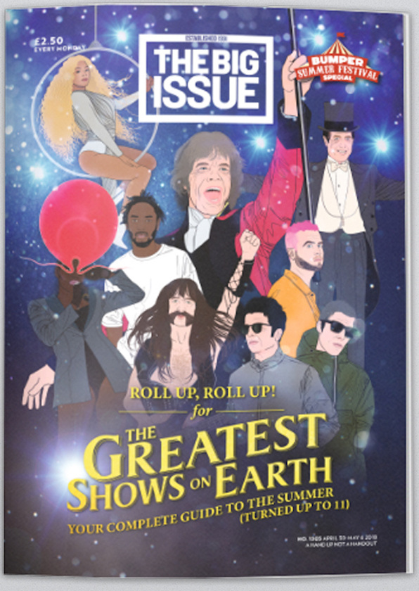
Another example would be the front cover magazine promoting The greatest showman. It powerfully presents famous movie stars - Christopher Wylie, Kendrick, Gallagher, Spinal tap guy, Grace Jones, Beyoncé and Hugh Grant – who are strongly influential and dramatically significant in today’s society. Since the release of the film, it has had a huge impact on its meaningful message towards the change of society, especially the song ‘this is me’. This appears to have a future as an anthem for the marginalized, disenfranchised, the bullied and the outcast. And in a year when “diversity” is on everyone’s minds and lips, that means it could gain further attention and purpose. The characters find their sense of power and pride – ‘we are who we are, and we’re going to own our own identity’, which is what The Big issue supports strongly and further emphasizes their own personal message towards homeless people and the society. Moreover, the magazine front cover is aiming to attract everyone; to address the issues of class, race and inequality. They do this by presenting characters of all races and colours, as well as the characters that are in different classes. For example, Hugh Jackman’s character (centred in the middle) came from nothing and made a name for himself through performing in a circus. The women that does gymnastics on a hoop, in the film, was black and poor and people treated her badly due to the lower class that she was in. This sense of positivity enables an optimistic message, giving people hope a purpose. This is further emphasized by the costumes: the colour and style of the costumes vary to differentiate the characters and what they look like. The film’s overall message presents that everyone is different and that you shouldn’t change to please another person. Everyone is special in their own way and people should not judge or look down on those that are seen as ‘different’.

To conclude The Big Issue exists to offer homeless people, or individuals at risk of homelessness, the opportunity to earn a legitimate income, thereby helping them to reintegrate into mainstream society. They present these issues, as well as politcal, social and cultural elements, through their front covers, upon colour, costumes, typography, actors etc. 


Jean Baudrillard