Monday, 29 April 2019

Titanium

Titanium introduction: 

- Is a song by French DJ and music producer David Guetta featuring vocals by Australian recording artist Sia.  
- Was written by Sia, David Guetta, Giorgio Tuinfort and Afrojack.
- it was initially released for digital download on August 8th, 2011, then it was later released as the album's fourth single in December 2011. 
- is a ballad which draws from the genres of house and urban dance.
- Jason Lipshutz of Billboard magazine noted that "the supernatural scene and suburban setting" in the video recall the science fiction film Super 8 (2011), in which Lee stars. Becky Bain of Idolater wrote that, "The video is beautifully shot, and is courageous enough not to answer all its mysteries." A writer for Capital FM called it a "very cinematic video" 
  • The song's lyrics are about inner strength (More on this later) 
  • The song's accompanying music video premiered on December 21, 2011 but does not feature appearances by Guetta or Sia. Instead, the video focuses on a young boy, played by actor Ryan Lee, with supernatural powers.
  • Along with other songs, "Titanium" was pulled from radio stations in the US after the Sandy Hook Elementary School shooting in December 2012, "Titanium" was pulled from radio stations in the United States due to the use of gun-related lyrics in the song. 
  • The music video for "Titanium" was directed by David Wilson. It was filmed in December 2011 in Sainte-Marthe-sur-le-Lac and at Dorval-Jean XXIII High School, in the province of Quebec, Canada. 
  • A 14-second preview of the video was uploaded to Guetta's official YouTube account on December 16, 2011. The full video premiered online on December 20, 2011. 

Intertextuality

Suggestions are mix of 80s influence, sci-fi, teens and the supernatural Research these?
Terminator 2 (titanium), Super 8 (the boy is in this film) ET (bike, suburbs, child's pov) 
and Superargo film. 

Themes: 

SUPERNATURAL          
SPECIAL POWERS
PUBERTY AFFECTING BODY AND MIND
INNER STRENGTH
STANDING UP FOR WHAT IS RIGHT/WHAT YOU BELIEVE IN
ADULTS V CHILDREN

Further meanings:

·         His upbringing was very traditional, being raised as a Muslim and at age 13 he began mixing music, which enraged his father, who wanted something else for his future. In the end, he proved that even if the world was against him, he would make it whether people liked it or not. That is the idea behind the video.
·         Titanium talks about our inner strength and being strong in ourselves. The meaning of this song is to be strong even when the world is throwing its worse at you. When bad things happen we must stand strong and not fall. As the song states, we must be "Titanium" which means to be strong hearted and strong willed. The first lyrics in the song talk about ignoring people who will shout at us and yell at us to put us down.
·         The song uses symbolism that extends throughout the whole song. The song uses guns and bullets as a metaphor to the hateful words that people will say to us. In the chorus Sia, the vocalist of the song, sings about being bullet proof. This means that we should not worry about what people say about us. In verse two, the song talks about how people can continue to shoot us down but its not us who will be hurt more if we stand our ground.
·         This song has a very empowering message to give to those who are bullied by people who continue to spew out hateful words and comments from their mouths.
·         Although the song's style of pop, techno music might draw a person away from the meaningful words, it has a very strong moral message
·         It means that when somebody is holding you down or lets say teasing you that you have something special in you that can make a difference and to not be afraid to show your true personality!


Thursday, 25 April 2019

shot analysis'

Stop Where you Are - Corrin Bailey Rae

background information 

    Image result for corinne bailey rae
  • Stop where you are - released April 2016.
  • In 2006 she was a rising star, full promises and was nominate for three Grammy Awards, Three Brits and won two MOBO awards.
  • Genre: Hybrid Soul/Pop 
  • Stands for strong British pride.
  • In 2008, her husband died due to an overdose and her music changed and challenged her emotion into her music - influencing this song. 
  • "sometimes we hold our happiness away from ourselves because we're waiting for the perfect moment."
  • "which is about being in the moment and being present, and stopping and ritualising the moment, celebrating it."
  1. DRCAGES
  2. SETTING 
  3. INTERTEXTUALITY 
  4. ARTIST
  5. THEMES
CAMERA:

F frame 
A angle
M movement 

MIS EN SCENE:

C costume
L lighting
A actors
M makeup
P props
S setting

EDITING: 

S screen time
T transition 
O order of narrative
P pace
S sfx


Wednesday, 3 April 2019

charity essay


Analyse how social and cultural contexts can influence advertising

In your answer you must refer to:
- Analyse how social and cultural contexts influence advertising
- Make judgement and reach a conclusion on why they advertise in this way
Image result for shelter print advert


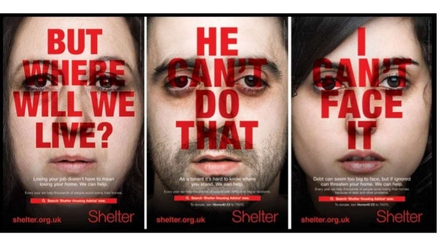
Shelter was founded in 1966, London and use hard hitting campaigns, such as this one, which launched in 2011,  and make audiences aware of life threatening problems happening in modern society such as homelessness, which is being demonstrated in figure three. They advise the government to make changes to help housing, as 1 in 200 people are homeless. By using a subject that is sensitive to some people and can affect many people lives one way or another it influences the importance of the advertisement and how people view it. The colour scheme of these adverts is quite complementary and rather standard (consisting of red, black and white) connote a sense of seriousness towards the issue of homelessness. Furthermore, this scheme further represents this recognizable message without much reference from the advert as a whole and from the audience. This bold, daring text - almost acting as a statement - overlays the individual faces to highlight their potential thought process, but also portrays the seriousness of their situations; it was taking over their life and they were ashamed of it, until they seeked help. Additionally, this typography, placed in the center of the spread, covering almost most of the advert, further shows the importance of 'shelter' and how they desire to help people and make a change; it stands out to the audience, against the pale, saddened faces, which contains emotive language in order to gain empathy from the viewer. Creating the atmosphere for the reader creates a sense of tension and potential change to help support the campaign. The social context helps portray the seriousness of the problem as many homeless are clearly visible in most towns and cities lying helpless with nothing. 

The lack of diversity when representing the photos help show that anyone can potentially become homeless, therefore it shows there is no stereotype for people that become homeless (which is emphasized by the 'normal' looking people on the poster.) - it could happen to anyone; even you. By illustrating them in this way, it pronounces the importance of the issue being raised in the advert. The actors used in the campaign are looking directly at the camera with a concerned facial expression and the language used ("I can't face it",) illustrates its reality by the pronoun 'i', they are presented as weak and vulnerable, who need serious help. There is a possibility that the individuals presented are ethnically diverse however there isn't much evidence, as well as using mixed genders.  The expressions on the faces are very bland and serious, this is ambiguous as it helps represent how anyone can become homeless however it allows the reader visualize the advert as they desire - some worrying more than others-. As the pale plain faces connotes that the people may be feeling weak and vulnerable however the Shelter charity can help vigorously reverse this. The brand image/logo is a key component of the campaign as the 'H' is in the shape of a house, this reminds the audience how the charity will either help you fund for a house or maintain your housing status. On the other hand, i believe that this makes the audience feel sympathetic to those in need as they begin to remember the good and joyful memories they have experienced in the own homes.

Each poster contains a difference scenario that shows how different people can become homeless in different situations. This is used to inform people that anyone is vulnerable but it can potentially happen in anyway! This creates links to social context of the audience of the luxury's they enjoy everyday however those in need don't even have a roof over the head again adding to the sympathy.

In conclusion, I believe that the images are used to show the inequalities of wealth in society (Shown through the lack of emotion on the posters), In addition this creates a sense of sympathy from the audience as innocent people are losing there homes. Postmodernism is used to show shocking images of innocent children to create a shock and reaction to try and gain peoples support and financial gain.


Tuesday, 2 April 2019

Charity Campaigns


Image result for shelter charity poster
These charity campaigns all use empathy and shock to capture the reader's attention.


Their aim:
The aims of this campaign are to raise awareness of homelessness arising in today's society, especially with the recession and the current climate, which is relatable to many people in today's society because it coincides with the issues of debt which people are faced with. Some of slogans used to really catch to the eye of the reader include; ‘but where will we live?’ this is a good clear message which gets the information across in a direct manner as this could happen to anyone down to their job or living accommodation.
  • Shock 
  • Empathy
  • Raise Awareness
  • Sad
  • Supportive
SHELTER:
  • Founded in 1966, London.
  • Homelessness and bad housing.
  • Advice to the government to make changes to help housing.
  • Campaign was launched 2011 to encourage people at risk of losing there house.
  • Poster ads, Facebook and Mobile messaging.
  • Amplify was the advertising company.
  • Pro Bono, public bonus means its free as it is a charity.
  • 1 in 200 people are homeless.

Conventions of the poster:
  1. Brand image.
  2. Slogan.
  3. Website.
  4. Main image.
  5. Information.
  6. Title.
  7. Emotion.
  8. Direct mode of address.
 the main focus of the campaign is poster ads, but FB and mobile messaging also used
- the poster campaign initially launched in four towns identified as hotspots for housing problems and ran from 21st August for six weeks.

What messages are being communicated (how is it communicated through media language)?
The message which is communicated is that everyone deals with issues and everyone thinks they cant do it, but with Shelter, they will help you get through it. The problem is shown through the red bold writing, as stereo typically red is shown as a problem or danger.

Who is represented and how is this constructed?
Each advert focuses on one individual, there is a man and 2 women shown, their ages differ but not massively. The man and right women are relativity young whereas the left women is older. They all look of similar class, but all have separate issues, for instance the man doesn't know where he stands as a tenant but the left women has lost her job which implies she will loose her house. The expressions on the advert are before Shelter help them, when they are still upset and unsure what to do.

Colour scheme - The image itself is very pale and dull, making the red writing stand out clearer. The dullness on the faces also reflect that they are completely low and think it cant get any better as you are pale when you are dead.

Font - The font is just very bold to state the facts and make the writing the main focus, not so much the image. The font is also see through, which makes it seem like the words are stuck into the people as they come through the writing.

Images - The images are of people who are having the problems. This is sued to gives a real life aspect to the audience and make them feel sympathy when seeing someone else in a bad situation.


Jonathan Emmins, founder of Amplify said: It was crucial to us that the creative had the ability to shock and stand out but without resorting to gimmicks. We wanted people to empathise, to never lose sight of the real people, the real faces impacted by the current economic and housing situation.”

Jean Baudrillard